Understanding people behind the screens
-
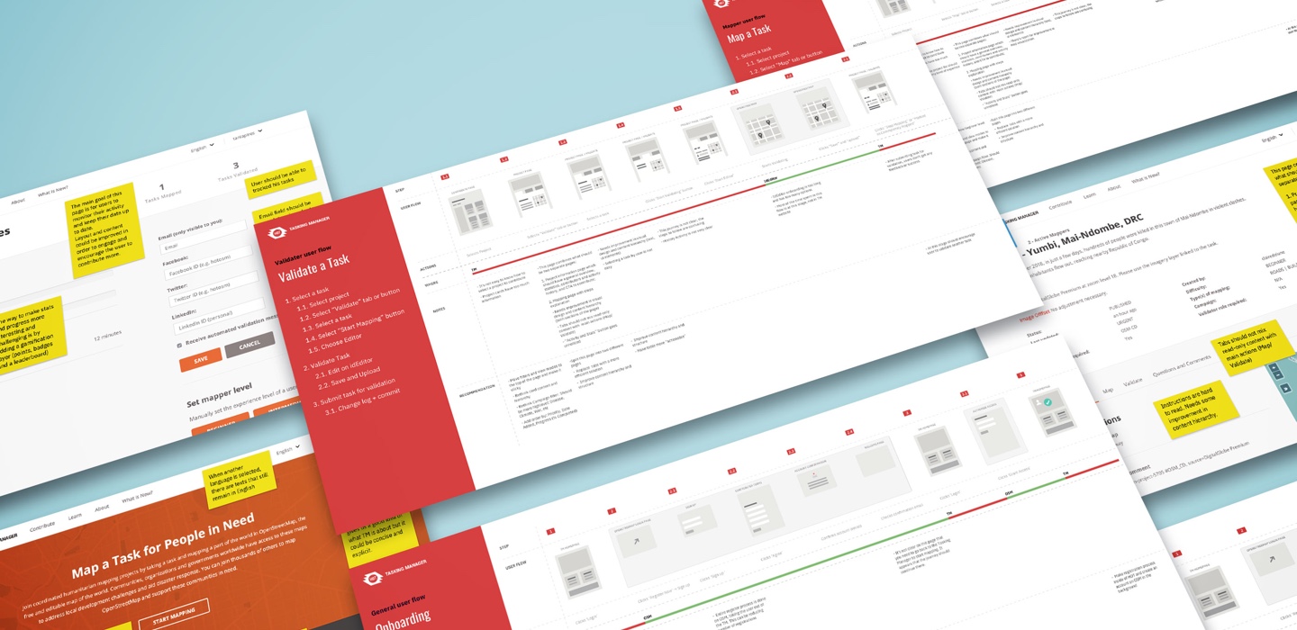
We started the project with a deep discovery phase. We wanted to understand the needs and motivations of the different users of the Tasking Manager — from volunteer mappers, to experienced mappers, from validators to project managers.
Through user interviews, data analysis, usability and userflows analysis, hours of HOTJAR session recordings, attending a Mapathon and running a stakeholders workshop, we managed to create a complete view of the Tasking Manager and opportunies for improvement.
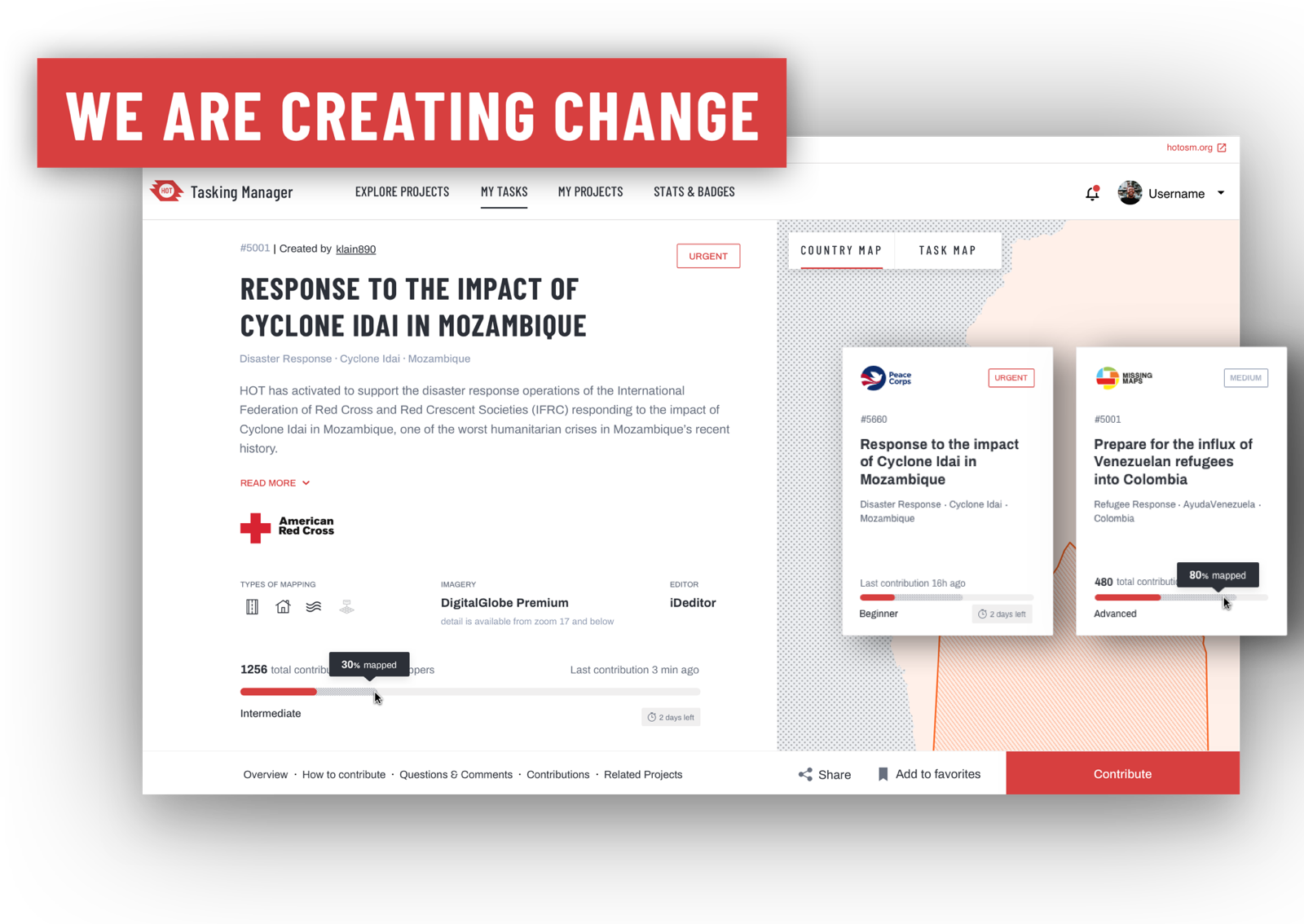
- HOT
Mapping the world for people in need.

-
HOT is transforming the way we map the world for humanitarian disaster relief.
-
When major disaster strikes anywhere in the world, thousands of HOT volunteers come together online and on the ground to create open map data that enables disaster responders to reach those in need.
The Tasking Manager, built by HOT is the leading tool to coordinate mapping projects in OpenStreetMap. Through the Tasking Manager, mapping projects can be created and split into tasks allowing for more collaboration, quicker mapping and faster help for people in need.
-
- Scope
- Research
- UX Design
- UI Design
-
- Challenge
Redesign the Tasking Manager in order to map the world faster.
HOT wanted help on a complete overhaul of the Tasking Manager in order to increase buildings mapped per minute, reduce number of mapping errors and increase users return rate.
- Solution
Improved mapping by reducing friction and better collaboration.
We worked with the HOT team, open source community and multiple stakeholders in order to find ways to improve the overall mapping experience for the different user groups.
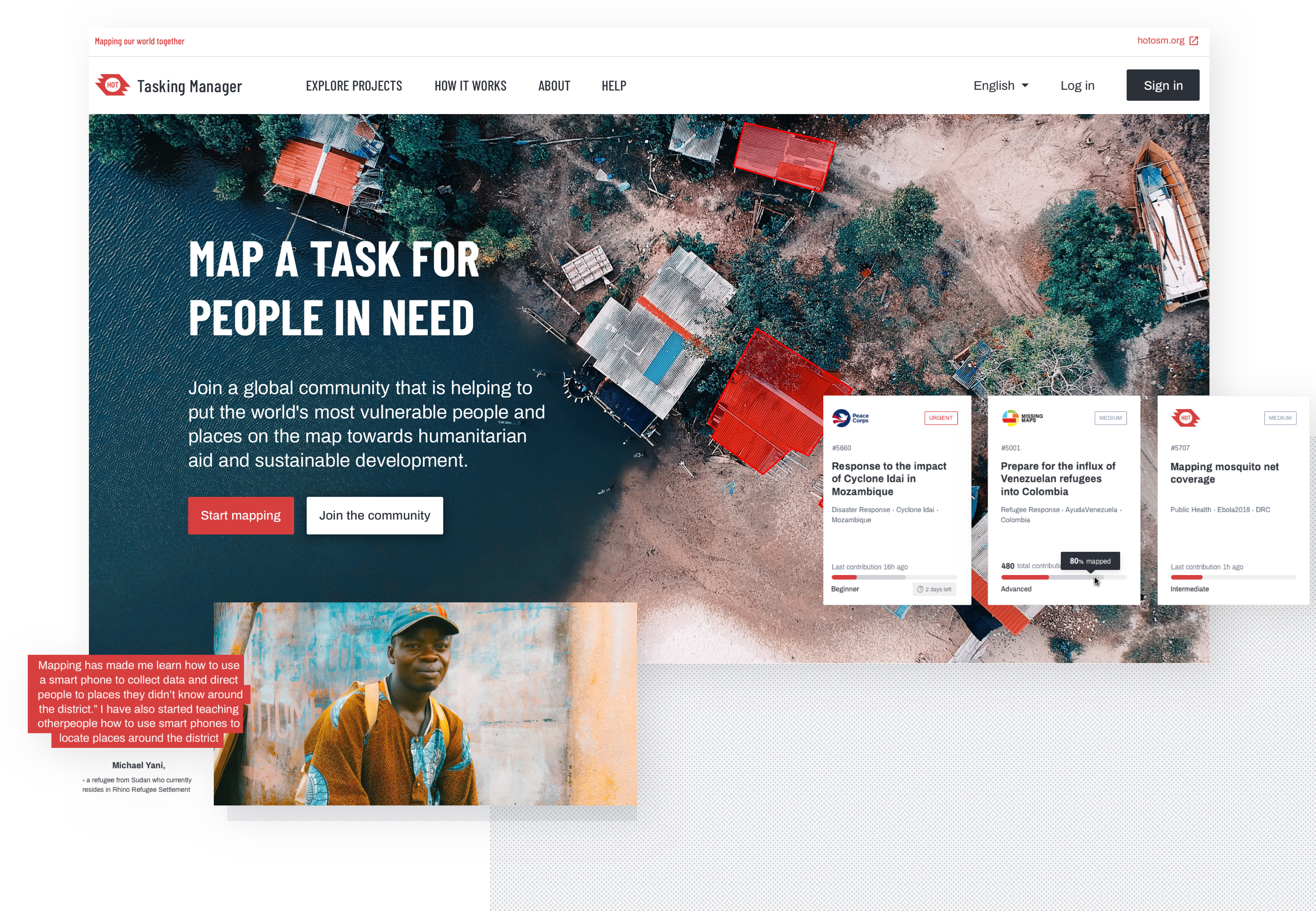
Storytelling for deeper impact
For the homepage our goal to tell a story. Not the tasking manager story, but the stories of all the people whose lives are improved by mapping efforts.
We wanted to ensure users perceive the real impact of mapping rather than focus on features, and show how easy it is to collaborate on a project even if you don’t have previous experience.
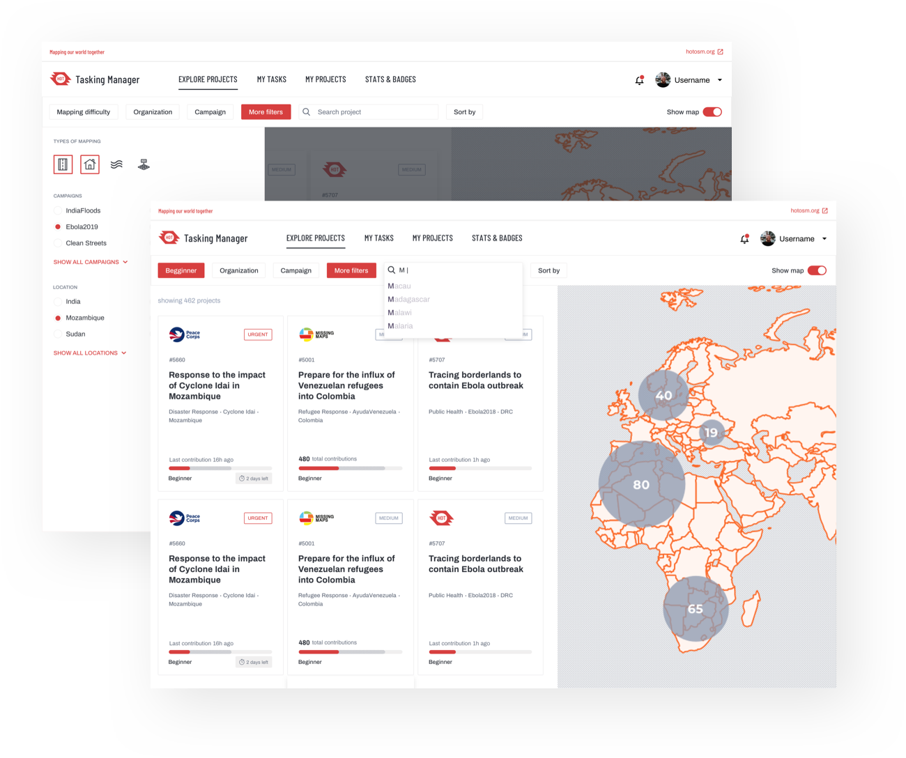
Streamline decision making
Research showed that users were having a hard time choosing a project to map, navigating through multiple projects and tasks before making a decision or eventually abandoning the process without mapping.
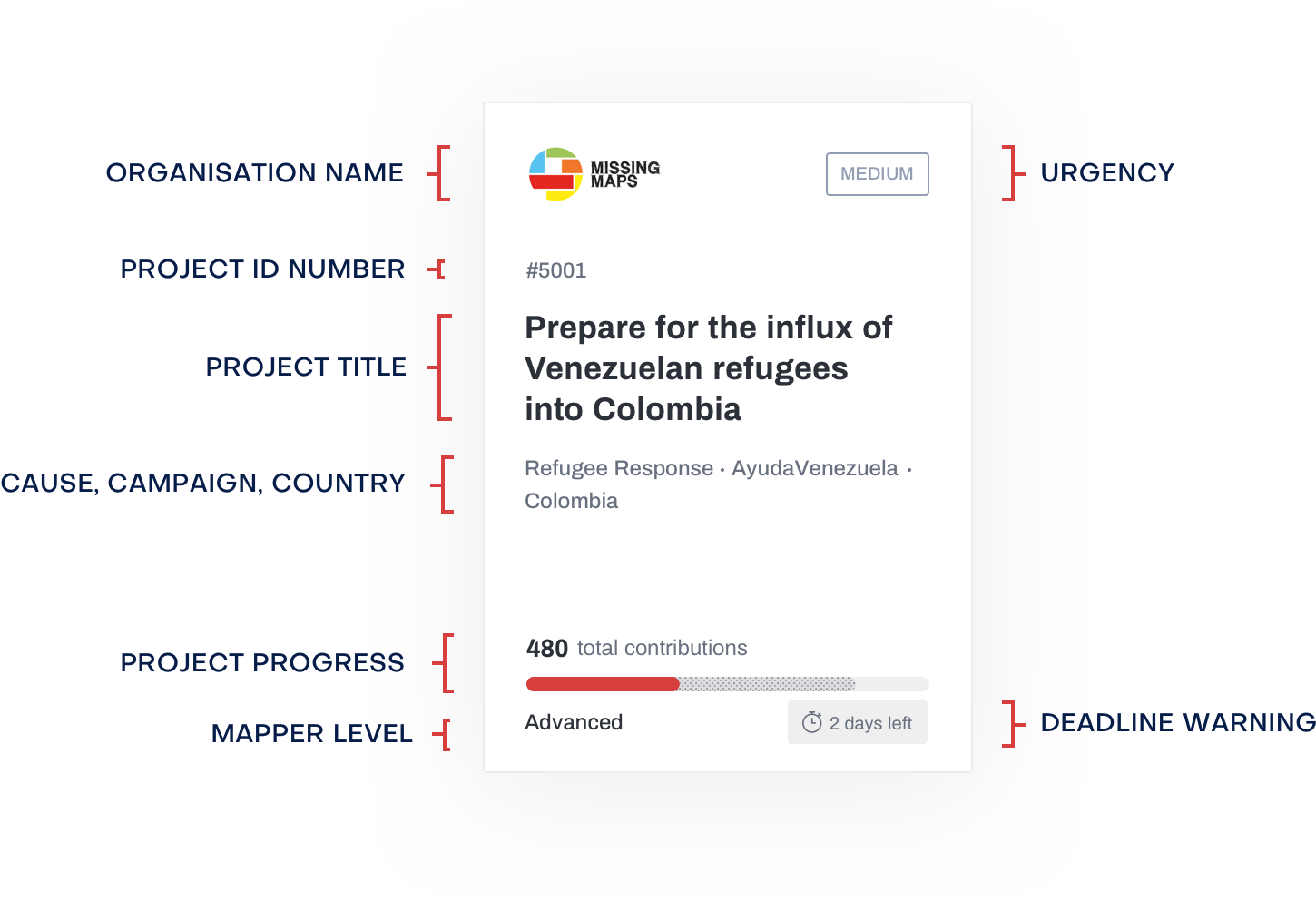
We redesigned the project listing, project cards and filtering system to make it easier to select a project. Mappers can view projects by cause, urgency, organization, country or their own mapping skills, narrowing down their choice to the best individual option.
Card Anatomy
Project cards provide a summary of all the information needed for a mapper to choose a project to contribute.
Information is displayed in a way that is easy to read and understand.
Better mapping worflow
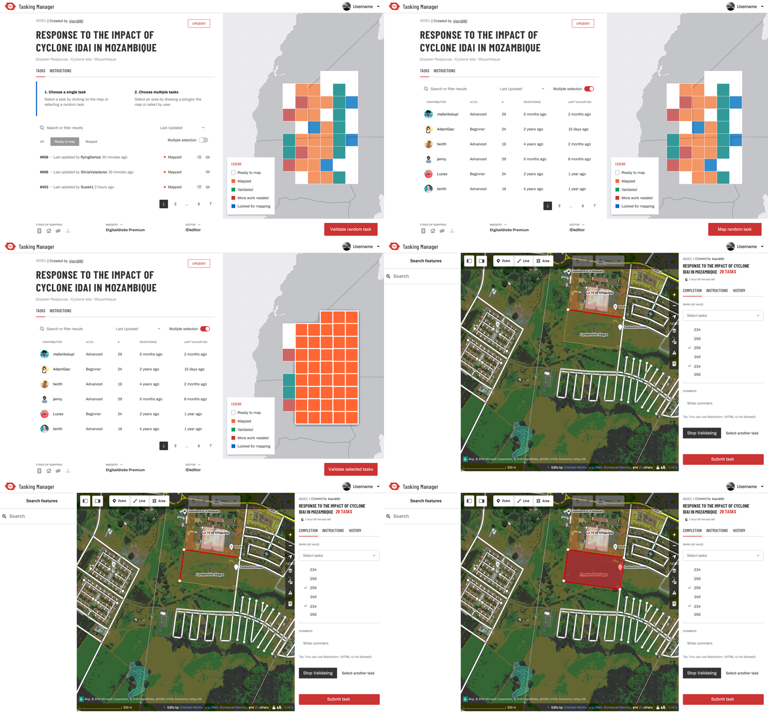
The Tasking Manager mapping and validation processes were divided across two different platforms, which was creating entropy and making it harder for users to complete the process. To smooth the process, we combined the entire journey into a single work environment that is straightforward and more efficient.
Bringing the IdEditor, which is the tool used in the mapping the process into the Tasking manager allowed us to create a continuous experience and prevent errors, reducing drop-off, and ultimately promoting a more rewarding user experience.
Personal Dashboard
-
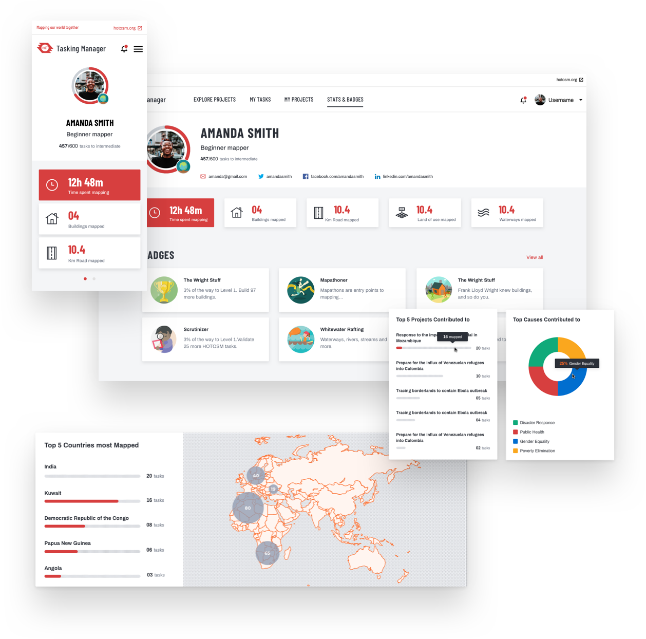
To stimulate mappers progress, we discussed using a badge system and introduce a little gamification. When completing mapping tasks, users are awarded points and badges allowing them to progress in their mapper journey.
The dashboard also makes it easier for mappers and validators to go back to projects and tasks they have contributed to.
Improved communication
-
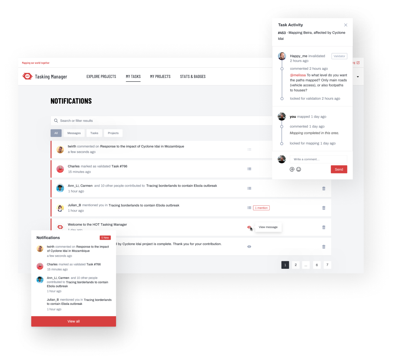
Users reported a lack of feedback and support from more experienced mappers during the validation process. In order to fill this gap, we improved the validation commenting, notifications and emails for both mappers and validators.
This allows users to iterate and communicate swiftly, supporting each other in the mapping process.
Responsive layout
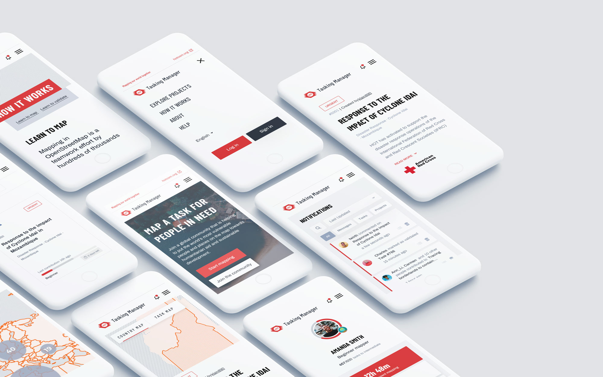
Even though the mapping itself can’t be done on mobile devices due to platform restrictions, the website is responsive, and users can get started on their journey from any device they choose.
By making the Tasking Manager more acessible on any device we made it easier volunteers to understand the process and get started on their process.
Major is a super friendly and professional design studio. Teaming up with them has been a pleasure. They delved into our subject matter and developed a groundbreaking design for our key application. This greatly improved the way people map to help others.
— Felix Delattre, Project Manager at HOT