Project image
Wodify Arena

Crossfit competitions, made easy.

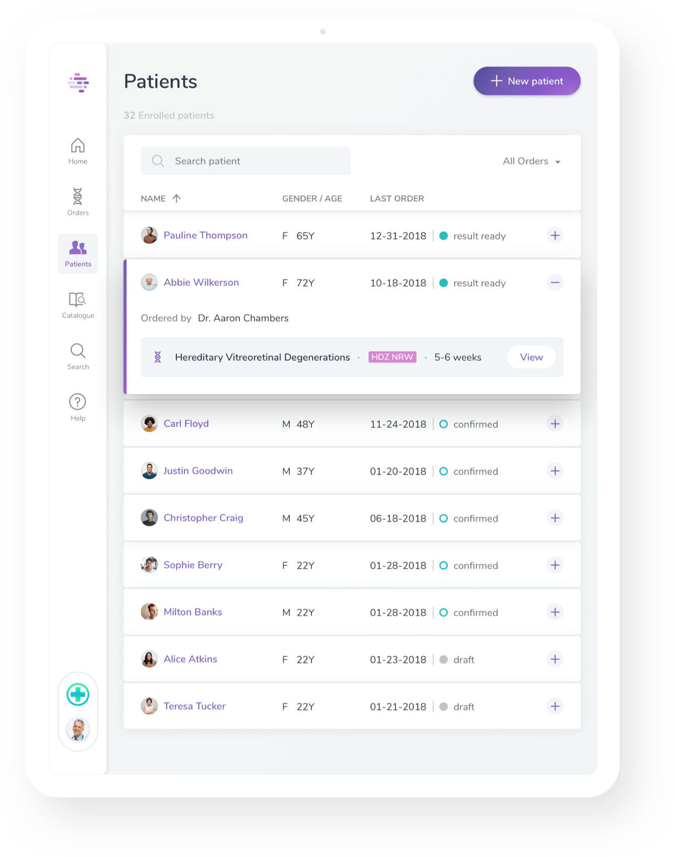
Elsie is a digital health platform to simplify how genetic tests are accessed, purchased and managed.

We built for Elsie a new digital strategy with the redesign of their digital supports improving the overall experience of the genetics orders workflow.

  • Scope
    Strategy
    Research
    UX Design
    UI Design
  • Challenge

    Rethinking Elsie digital position in the genetics market

    Analyse and increase Elsie digital presence in the healthcare industry redesigning the website and the existing web platform.

    Solution

    Designing a new digital experience in genetics

    In collaboration with Elsie’s team, we built a new digital strategy that consisted in finding the positioning of the company in the market with a redesign of the website and the platform.

Discovering Elsie

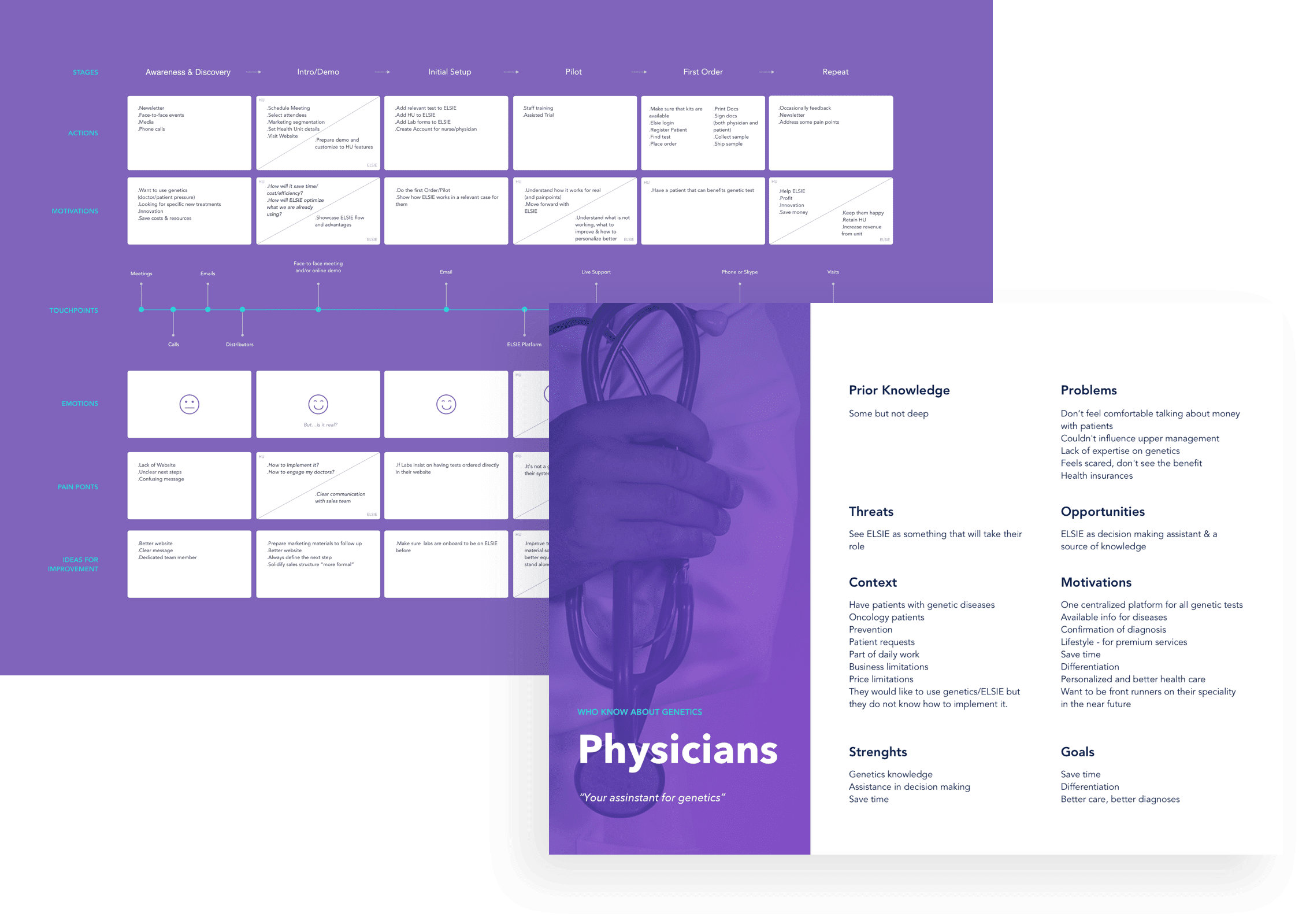
What are the main problems that led Elsie to come to us? Whith whom and how is Elsie communicating? Who is looking for Elsie and why? Who are the business partners? Who are the product users? A set of genetically sctructured questions to get to know Elsie.

Main image
Main image

Defining a digital strategy

Listening to those who were profoundly knowledgeable about the genetics business has created the space for us, togheteher with Elsie team, to point in a direction of intervention. A roadmap was created which included the redefinition of the brand, the redesign of the website and the platform.

A website with a new DNA

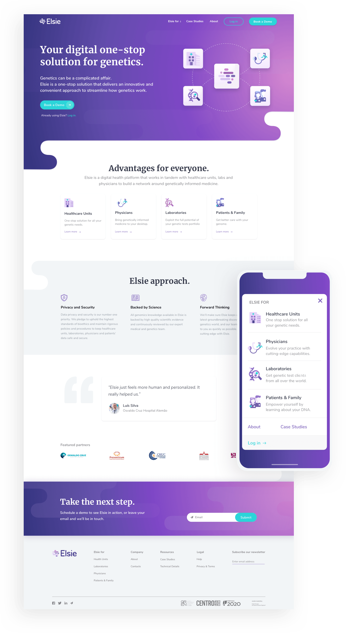
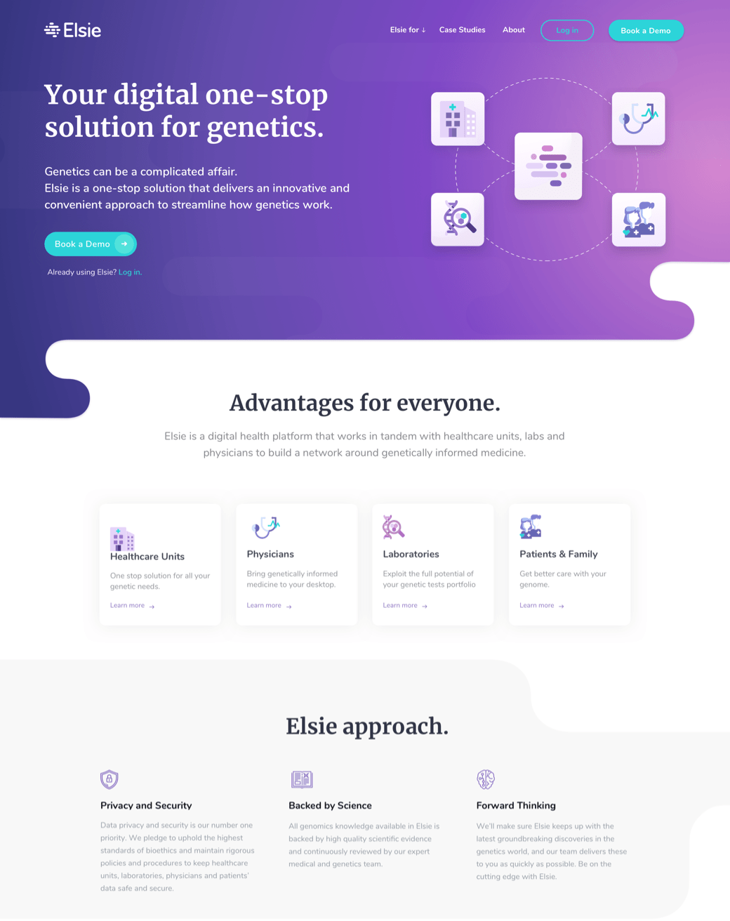
The gateway that generates the brand’s first impression to healthcare facilities, physicians, laboratories and patients. The structure of the new website was carefully designed to be aligned with these different audiences and the UI designed to be adaptable to the contents that are being updated.

Main image

Editing genes for a simple future

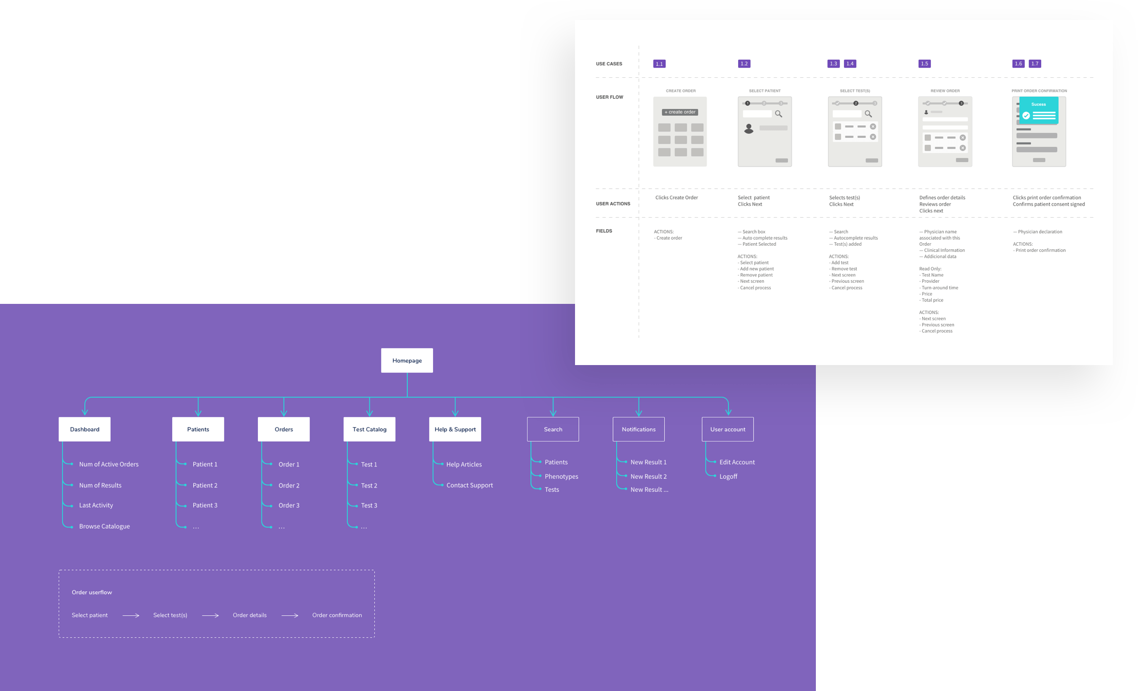
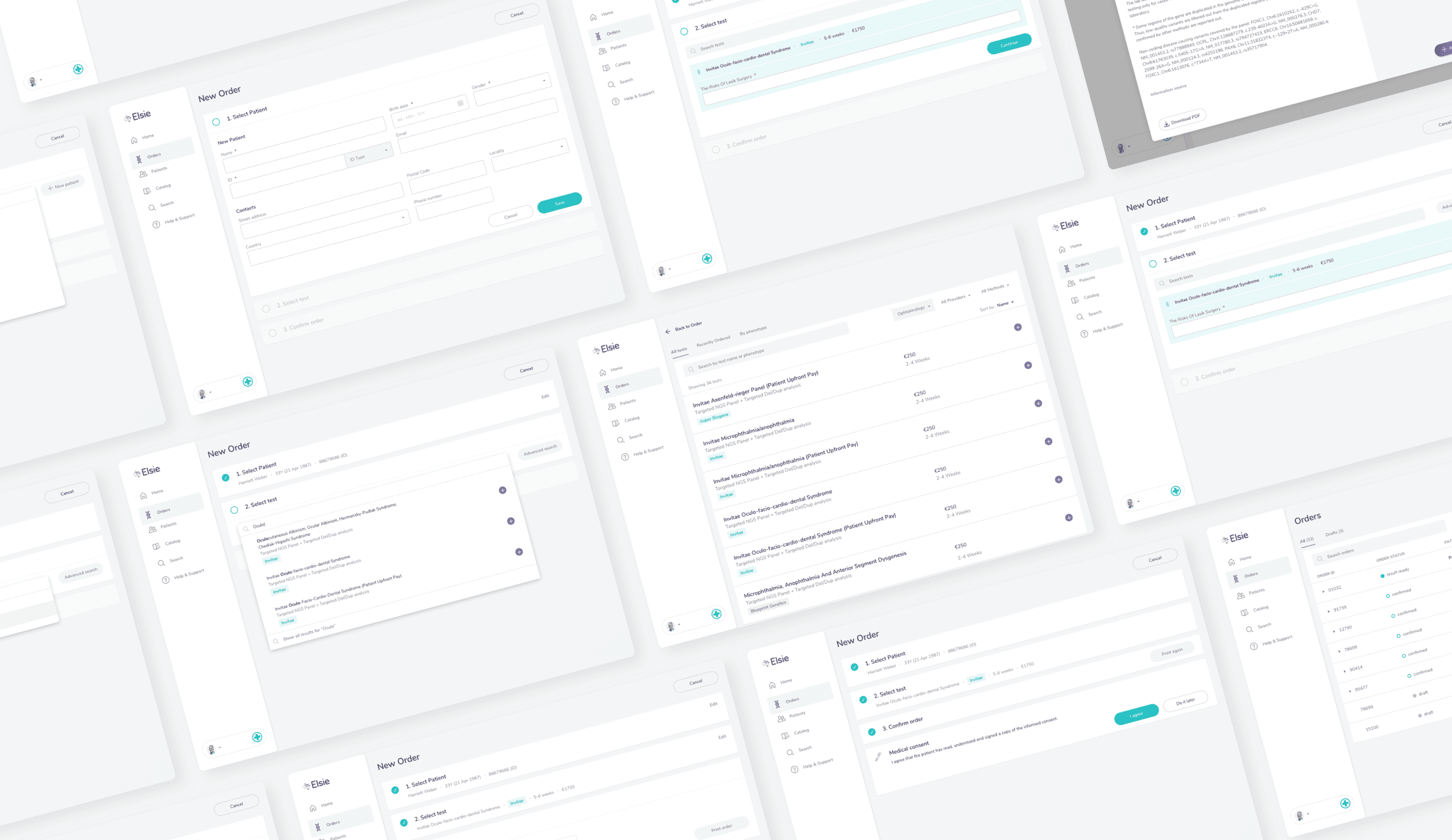
Asking for a genetic test can be tricky. We spoke to medical experts about this task so that together we could apply the best practices to make this task easier.

Main image

Simpler, clearer, more stable

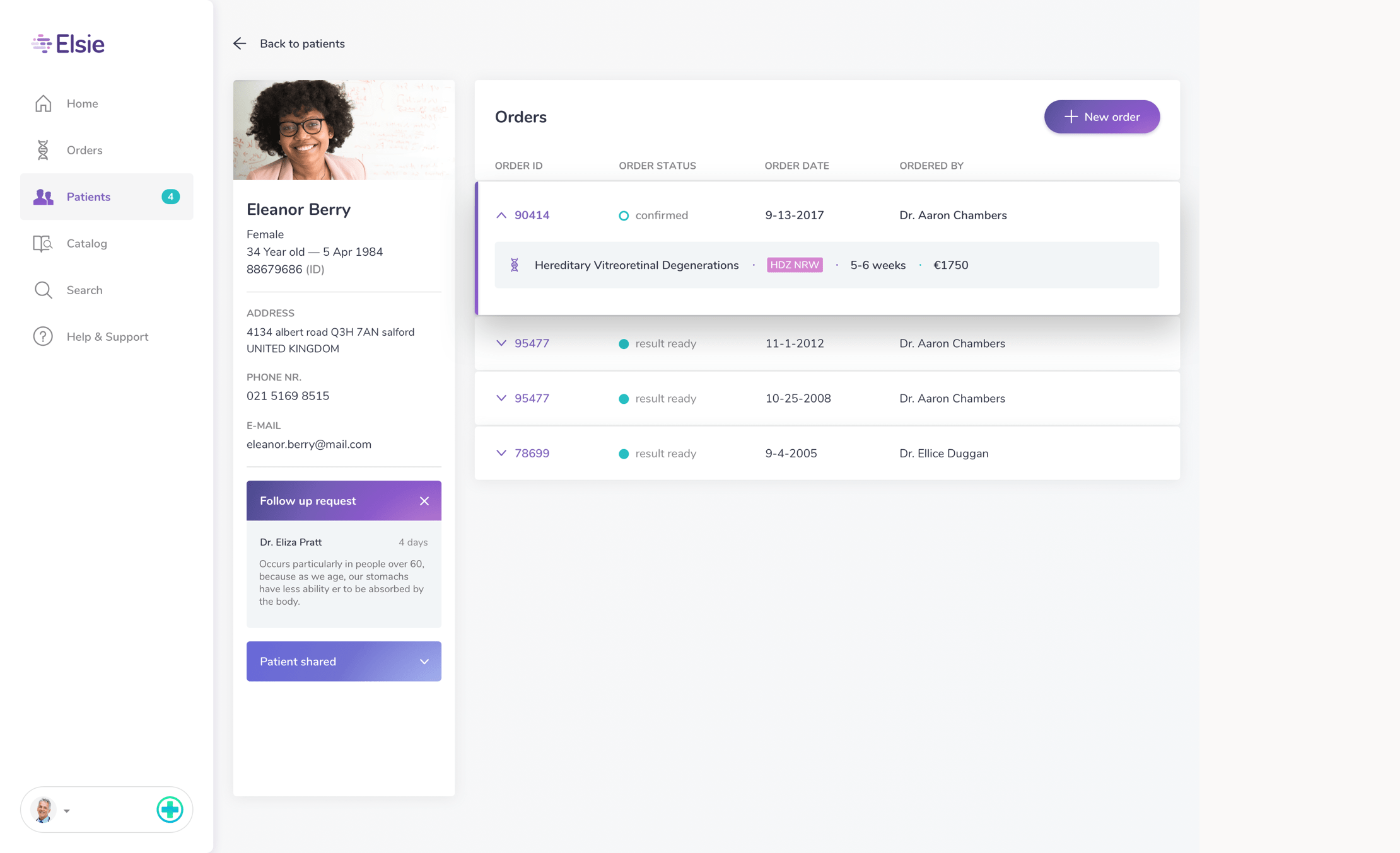
We started by intervening in the main flows so that development would start as early as possible and the application could be tested on the most commonly used features.

Main image

Responsive? We got you

Taking into account the various physical scenarios in which these tasks are executed, the application was designed responsive in order to deliver the best user experience.

Main image
Main image

This is a quote with the background color set with the main color of the project

— Name of the person, Role at Company nam